Project Overview
Next Level was an Ariix training event that helped representatives of the multi-level marketing company get excited about growing their businesses.
Under the direction of the Creative Director at Ariix, I designed the logo and some promotional materials for the event. Some of the promotional materials that I designed included emails and social media assets (for blogs, Instagram and Facebook).
Challenges
The purpose of this event was to energize and motivate company representatives to take their businesses to the “next level”. We wanted to illustrate this energy in the event branding.
solutions
I used layering of typography and imagery to illustrate the idea of taking things to the “next level”. Bright, neon colors and bold imagery were also incorporated to create excitement and energy.
LOGO DESIGN
I wanted the logo to have a kaleidoscopic effect, which I created with the overlapping neon colors. As the colors overlap, they create new colors. This illustrated depth and the idea of ‘levels’.
Standalone logo mark.

Logo variations.
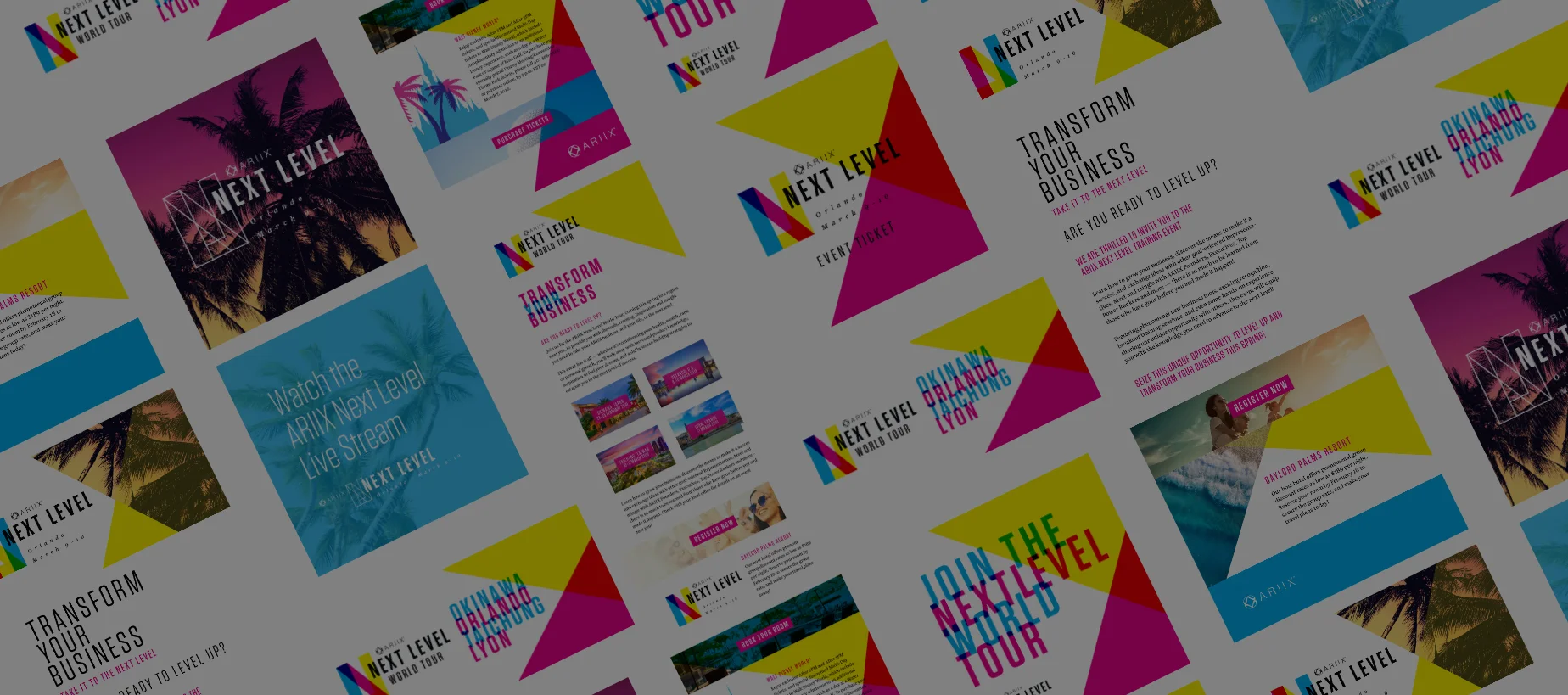
Social Media Assets
The colors used in the promotional materials were bright, bold and energizing in order to grab attention and to motivate. Images used were meant to evoke excitement about the location and event. I used lifestyle, environmental and textural images to illustrate this.

Social media assets for Instagram and Facebook.
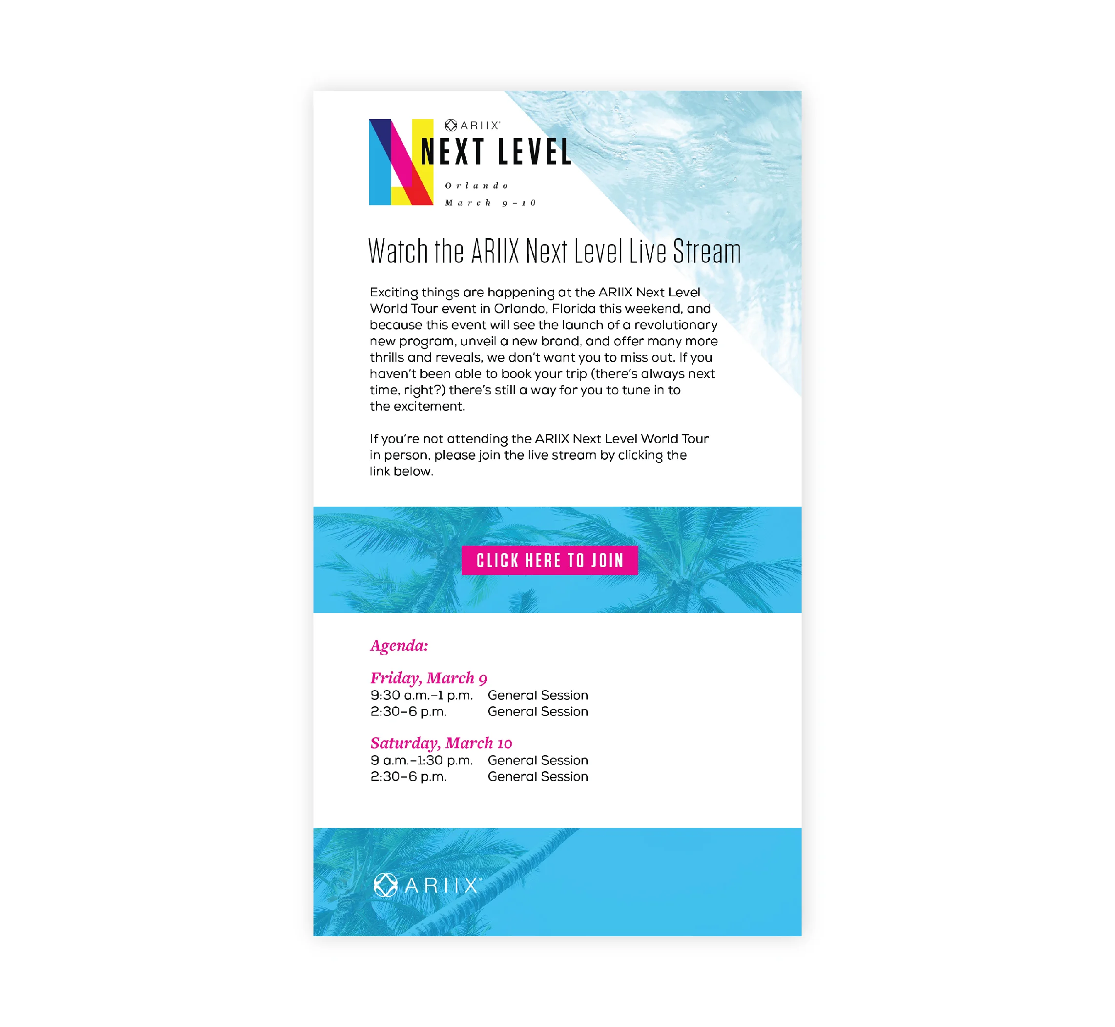
Emails
For email communications, bright, bold and energizing colors were used, as well as lifestyle and location specific images. For the typography, existing Ariix brand fonts were used, along with another typeface for body copy. This helped create consistency and prevented visual competition between the logo and other typographic elements.

Key Learnings
Choosing a font for the logo that would go well with existing Ariix brand fonts was very important. This was important to prevent competition between the fonts in the email and other event communications.
It was important to create a logo that could be adapted to use in a variety of ways and with changing information, such as location and dates.