
Project Overview
For this project, as UX students, we were asked to design an unconventional organization app. I decided to create a reminder app, Creo, designed specifically for creatives and right-brainers. Instead of typing out reminders in your phone, with Creo, one can draw their own abstract reminder that will pop up at a selected time.
For Creo, I used exploration tools such as user research, affinity diagramming, sketching and storyboarding to discover problems in current organization apps and find possible solutions that would specifically help creatives and right-brainers. I wanted to create an organizational app that would be both fun and useful.
Challenges
Keeping a to-do list can be a task in and of itself and can often be boring. Organization apps often don’t fit the lifestyle of a free-spirited creative. Many of today’s organization apps are missing personal touches.
solutions
With Creo, drawing and handwriting make organization more personal and reflect the lifestyle of a creative. Creo becomes more like a journal or a visual representation of tasks. Being expressive and organic with tasks in Creo makes organization fun.
DISCOVERY
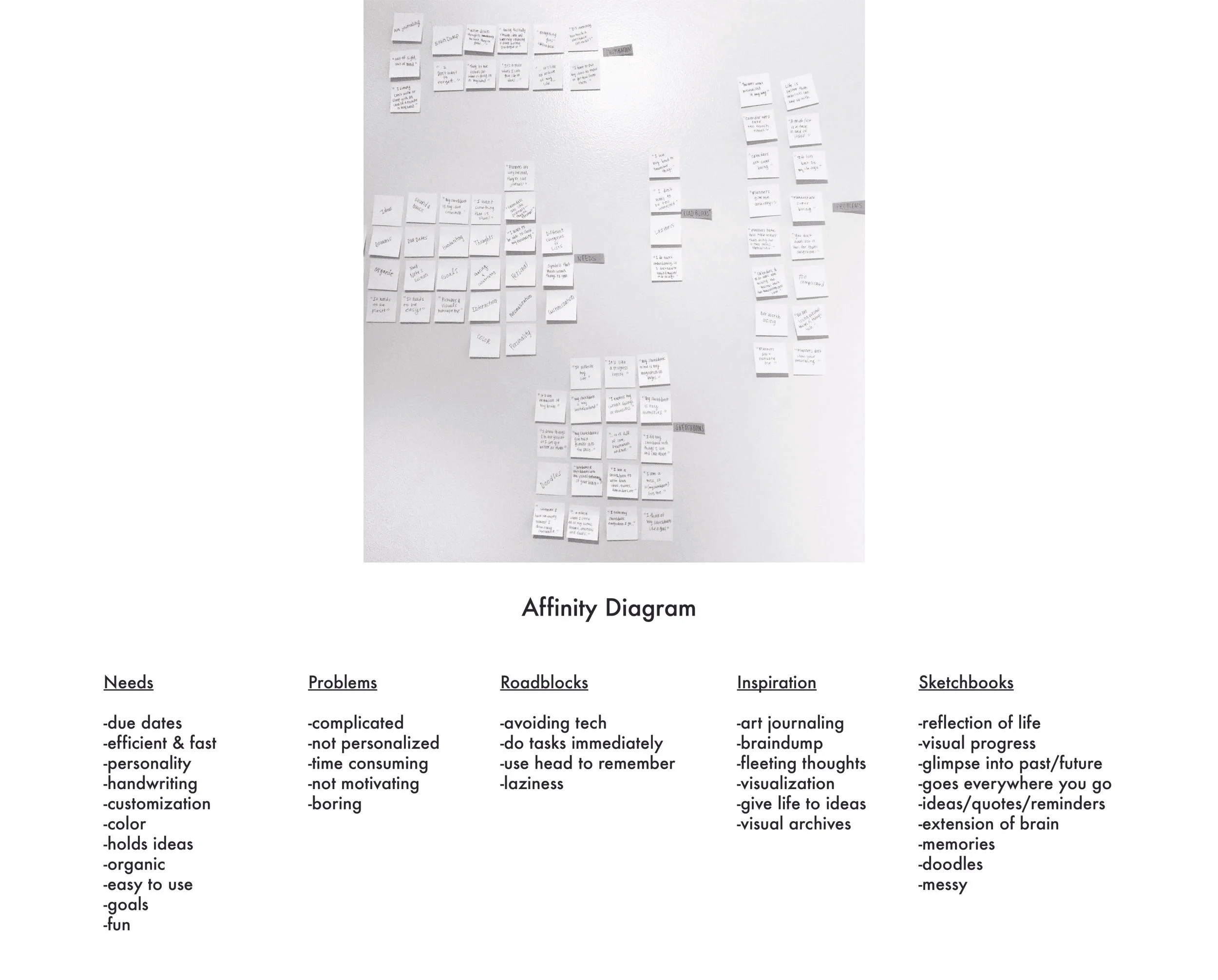
Affinity Diagram
Before beginning design on Creo, I conducted user interviews to gain a better understanding of problems in current organization apps. Creating an affinity diagram helped me to organize and visualize the natural relationships of the data gathered from the interviews.
Key Insights
Organizing and keeping track of ideas can be complicated, impersonal and stressful.
Visualization, creativity and personalization are key motivating factors for users.
Users often use sketchbooks in place of calendars and other organizational tools.
PERSONA

Based on discovery and research, a persona was developed. Creating a persona helped me to always keep the user in mind, to inform design decisions.
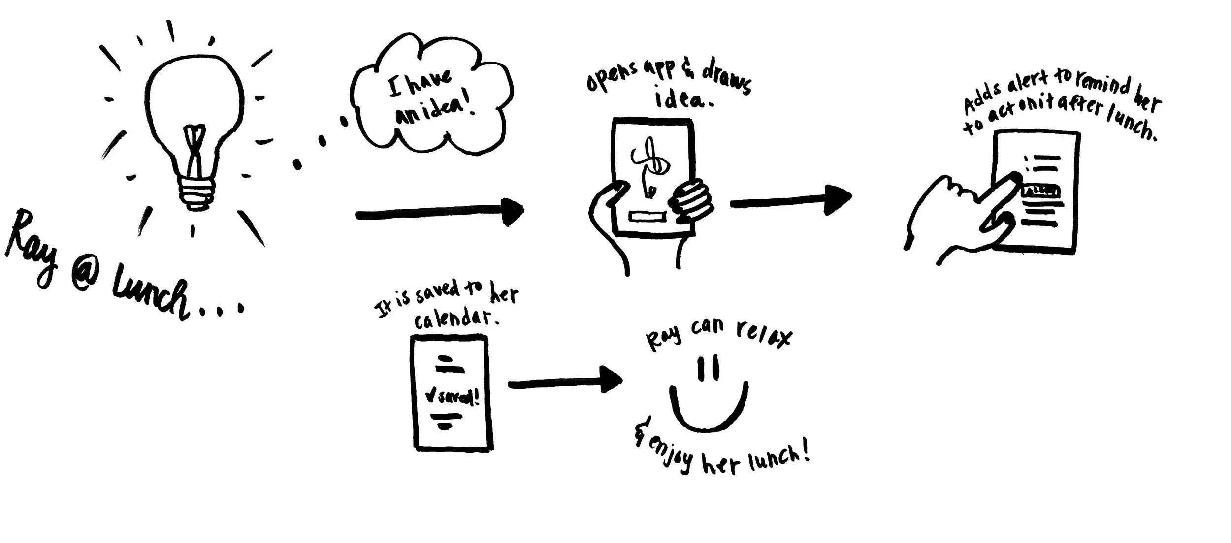
User Behavior Flow
I storyboarded Ray’s user behavioral flow for drawing an idea and creating a reminder. Doing this helped define necessary features for a positive experience navigating the app.
SITE map

Understanding Ray’s behavioral flow helped inform pages and features needed in the app for it to successfully function.
WIREFRAMES
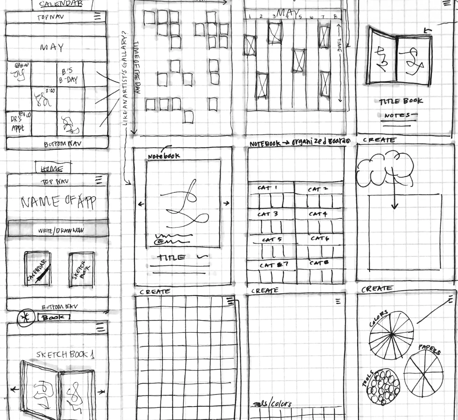
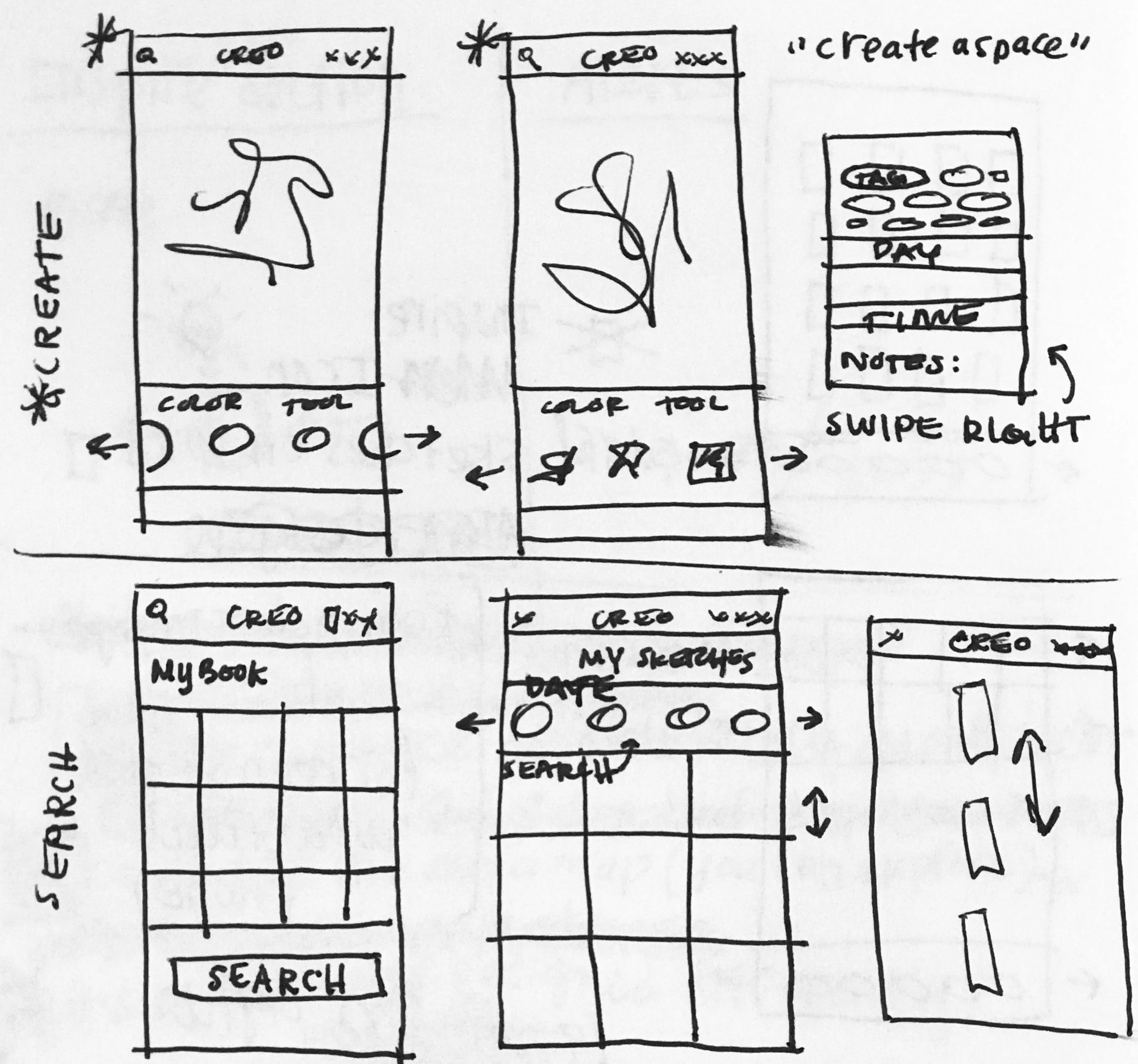
Ideating through sketching low-fidelity wireframes helped explore how the app could look and function with the needed pages and features defined within the site map and user behavior flow.
FINAL DESIGNS

Based on wireframes and information gathered, high-fidelity designs were created. These final designs included visual design and branding for the app.
Key Learnings
More user testing was needed after the creation of wireframes and final designs to test the usability of the app and to improve it even more.
Conducting good user interviews in the discovery phase of the design process helped set the tone, inform, inspire and push the project in a good direction.